
The Buffalo Sabres have been at a bit of an aesthetic crossroads lately. Ever since they scrapped their red and black look in 2006, They've been struggling to maintain a balance between the classic and timeless royal and yellow appearance of their earlier days and the modernization that the Reebok EDGE template tends to force on teams. In some cases, the EDGE template has helped (
(source: NHL Uniform Database)
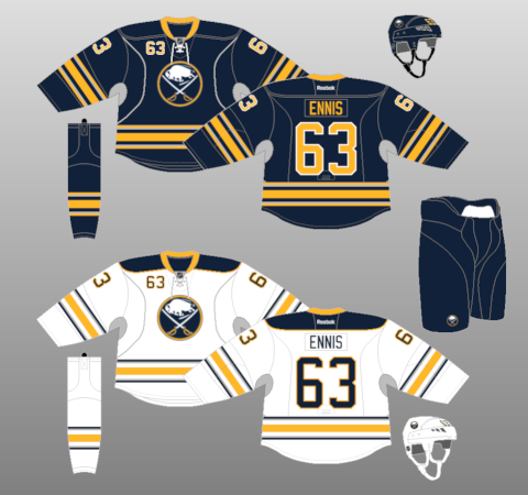
I apologize for subjecting you to that, but it's a necessary evil. Everything about this set just seems wrong. Navy? Strange, curvy piping? Front numbers? Silver? These weren't your dad's Buffalo Sabres, and it was a shame, because there was nothing wrong with what they had from 1970-1996. Anyway, here's their current set:
(source: NHL Uniform Database)
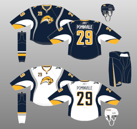
Better, but all they did was lose the silver, slap the old logo back on the front of the sweater, and put the classic yellow striping back in. That awkward piping is still there, as is the front number, and the navy. I was only 9 years old when they began their identity crisis, but as someone who vividly remembers the Rangers' 1994 Stanley Cup run, for example, I know that the Sabres are not and should not be navy. They should be royal. Their anniversary jersey (below) is the color that they need to go back to.

(source: Sabres' Official Website)
I'll be honest, nothing else about that jersey appeals to me except the royal and the "Buffalo" wordmark with the logo below it, but it's better than any jersey they've had since reverting back to the realm of blues and yellows. But wait! Help is on the way! The Sabres teased a new third jersey yesterday, and Jhonas Enroth got a special sneak peek of the new sweater on Twitter, for all his fans and followers to see. What a standup guy, thanks Jhonas. As you can see from the link, it appears to be a gold/yellow jersey with a navy shoulder yoke. For starters, I'm glad it's not black. Many teams have done black for the sake of it over the years and the trend seems to finally be subsiding. Given that yellow is the primary focus here, navy actually works better than royal would for the shoulders, so in this case I'm glad the Sabres stuck to their guns.
Yellow has only recently been explored as an option for a home sweater. Nashville went yellow for their home uniform in 2011 and it's been met with praise, though I am not among those who approve of their look. It's mainly because I'm not a fan of yellow, but it also has to do with the unnecessary piping and those odd stripes on the numbers. However, Buffalo seems to have taken that into account, because there are a number of other elements at work here to ensure that the jersey isn't too loud or outlandish. Blue pants with a new wordmark that looks pretty sharp. The sleeves appear to be yellow on top and white on bottom, which is what Nashville used to have. A "BUFFALO" wordmark just below the collar, which is definitely NFL-inspired. Not sure how it'll work on a hockey jersey, but we'll see the full getup soon enough.
Oh, and then there was this recent tweet from hockey jersey blog Icethetics:
"Another source with an odd report: #Sabres 3rd jersey will be gold in front, navy on the back! Should get concept artists thinking."
Uh-oh.
You can watch the teaser video here.
No comments:
Post a Comment